The Social Networks of College Campuses
05 May 2020This is a longish post, so here’s a TL;DR and links to the highlights:
- We build a scraper (against Instagram’s Terms of Service) to map social networks.
- The social network of Berkeley is incredibly racially segregated.
- We look at other schools to see if they also have “implicit segregation.” Our hot take: “implicit segregation” is a result of large schools.
- We talk about our methodology in a bit more depth.
Many of the things here are to some extent “common knowledge” but I think it’s interesting that we can give some sort of empirical, objective evidence for these phenomena. If anybody knows of prior work in this area (I would be highly surprised if I were the first to look into this) please let me know!
Violating Instagram’s Terms of Service
Here’s something interesting about Instagram. It turns out if you follow anybody whose account is public, even if your account is private you will show up on their “followers list” available for the entire world to see. This fact makes Instagram an incredibly attractive platform to scrape for social networks, which is exactly what we did.
This is of course against Instagram’s Terms of Service, as per “General Conditions” section 8:
We prohibit crawling, scraping, caching or otherwise accessing any content on the Service via automated means, including but not limited to, user profiles and photos
The Scraper
The details of the scraper aren’t terribly important, so I won’t bore you with the nitty gritty details. But for completeness I’ll give a brief description here (feel free to skip to the next section). Let’s say we’re scraping Berkeley’s network. Essentially we do a priority search starting with a few people we know for sure are in Berkeley, where priority is assigned as “the number of times we’ve seen this username in the list of followers of someone we are fairly sure is from Berkeley.”
What does “fairly sure is from Berkeley” mean? Well, we found it simple enough to look for certain keywords in a user’s Instagram bio such as “Cal” or “Berkeley” or “Go Bears” (it’s a rather nice fluke that the majority of people seem to insist on identifying which college they go to in their Instagram bio). Using this rather simple method we actually get a really decent scraper.
For more information please see the methods section.
An Overview of Berkeley
We first scraped Berkeley. Using our scraper we get the usernames of people who go to Berkeley, who they follow, and how many “hearts” they get per post. Here is the social network plotted out:
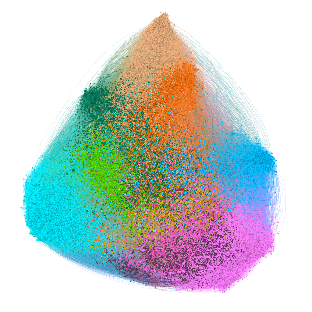
There are about 30,000 colored specks in the graph, each corresponding to an Instagram user who attends or has attended UC Berkeley (at least, with high probability). The thin wispy lines indicate connections between users. The location of the nodes are chosen so that users with common connections are closer to each other (using ForceAtlas2) and the specks are sized according to average likes per post and are colored according to “social group.”
These “social groups” are found by running an unsupervised clustering algorithm on the graph. Surprisingly, these automatically detected clusters correspond incredibly well to real social groups!
At this point you might have all sorts of questions about the rigor of this analysis, so for more information please checkout the methods section.
Social Groups of Berkeley
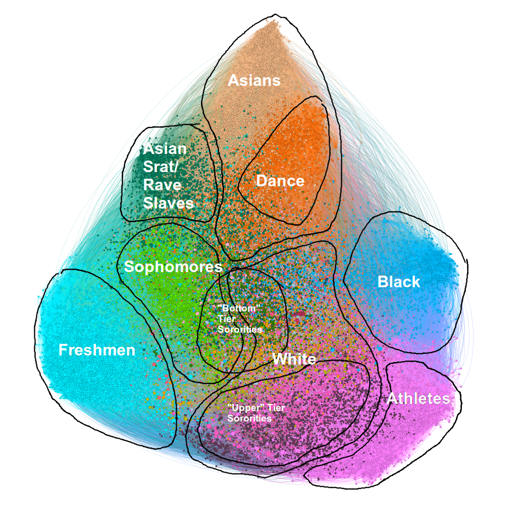
Here we’ve annotated roughly what each social group each color corresponds to. It’s actually quite remarkable just how racial these clusters ended up being. Of course people can be part of multiple social groups, but these clusters are striking for their absolute uniformity. For example, sampling people from the “athlete” cluster almost always ends up with an athlete, while sampling outside the “athlete” cluster almost never results in an athlete. Within the “racial” clusters we get some 70% - 80% homogeneity! (Again, the methods section has more info).
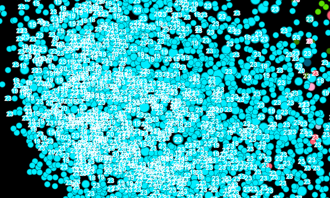
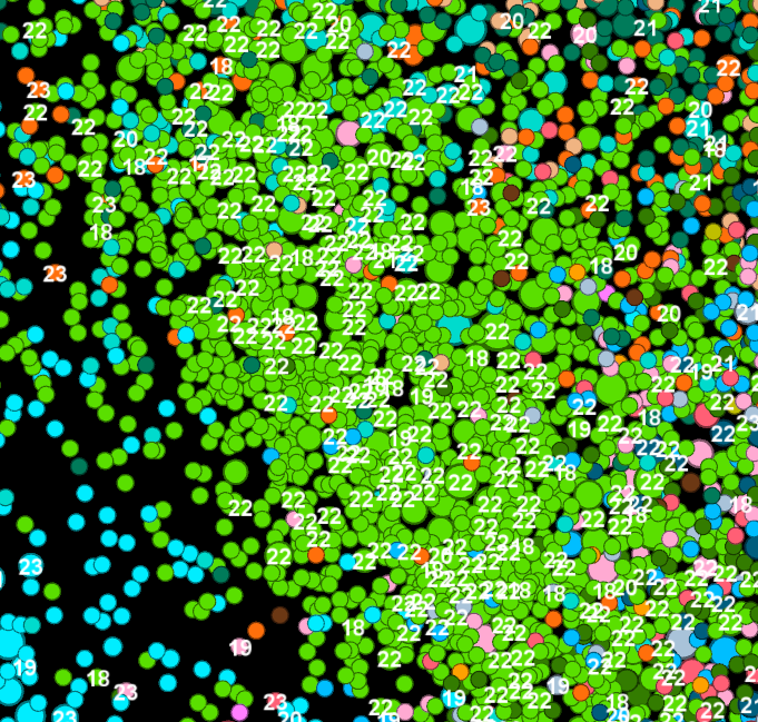
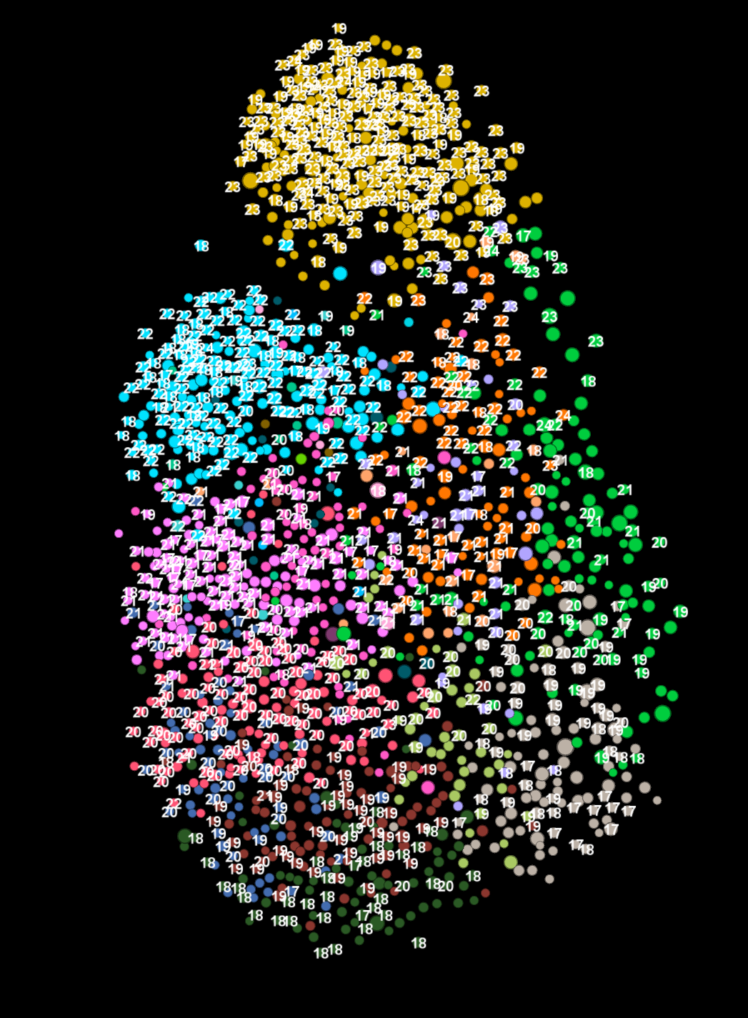
You might be wondering how we can be sure what each group is. Well, we can do two things. First off, we can parse each user’s bio (which quite frequently contains very useful identifying information such as “college attended,” “graduation year,” and “frat or sorority”). For example, parsing user summaries for graduation year and superimposing the years on the graph we see that the cyan and light green clusters almost exclusively have years “23” and “22” (along with “19” and “18” for the corresponding high school graduation dates):
|
|
The same sort of strategy works to identify various fraternities and sororities as we’ll see in the next section.
And secondly, we can do the naive thing and just literally look at (stalk) the users in each social group. This is of course less desirable, but I think it gets the job done. We resort to this strategy when labeling the clusters with a certain type of race.
You might be curious about what sorts of accounts are in each cluster. I don’t think I should list personal Instagram accounts here (even if they’re public), but I think listing professional or organization accounts should be alright:
- Asian Frat/Srat (“rave slaves”)
- Asians
- Black
- White
- “Bottom” Tier Sororities
- “Upper” Tier Sororities
- Athletes
- amybilquist (swimmer)
- kristine__31 (WBNA)
- thekid.da
- rayraydavison (Kansas City Chiefs)
- chadhansen6 (Houston Texans)
Social Hierarchies in Sororities
In this section we’ll talk about the sororities at Berkeley. Sororities are nice to look at because so many sorority sisters are active on Instagram and seem to love to publicize their greek letters in their bios. This is as opposed to fraternity brothers who seem to be much less active on Instagram and tend not to put anything useful in their bios (at least, not useful to us!).
Let’s zoom into the “greek life” area of the social network. Here I’ve labeled the sororities that various users are associated with:
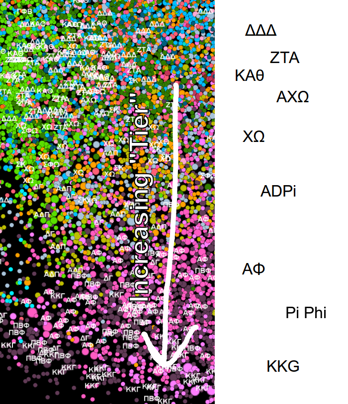
You’ll notice right away that this area of the graph is a lot more colorful! This is (at least it seems to me) because people in greek life tend to be very clique-y. In fact, the clustering algorithm seems to actually be able to cluster individual sororities. For example, Zeta is a dark green, near the top. Alpha Phi is pink, near the bottom. And Kappa Kappa Gamma is a dark purple also near the bottom. What’s crazy is that this clustering has predictive power: we can actually guess what sororities people are in, even if they don’t mention it in their summary and even if their account is private!
I’m also told by a friend who knows about these things that the order in which the sororities appear in the image seem to be ordered almost exactly according to their “tier.” For example, Alpha Phi, Kappa, and Pi Phi are the “highest-tier” sororities and they all appear clustered together at the bottom. The cluster at the top of the image are apparently “lower tier” sororities, consisting of people from Tri Delta, Zeta, Theta, and others. In addition, it’s interesting to note that diversity seems to decrease in the same direction as increasing “tier” (in general, the further away from the center of the social network the less diverse). Interesting!
I don’t know much about sororities, but based on the image alone I would hazard a hypothesis that there are perhaps two different groups of sororities which both keep mostly to themselves. One group being “lower-tier” but more diverse and the other group being “higher-tier” but less diverse.
The Gradual Segregation of Berkeley
You might have noticed that there’s a “freshman” and a “sophomore” cluster but there’s no “junior” or “senior” cluster. Here’s a hypothesis I have about why that’s the case. When people start school in Berkeley they are forced to hang out with their dorm-mates and their floor, people essentially randomly selected (except for maybe your roommate). So everybody becomes friends with everybody on their floor, and the floor above and below them, and you get this big cluster of freshmen in your social network. The next year people move out of the dorms and start making their own friends by themselves and enter new social circles. So the group of sophomores shrinks and the other social groups expand (this is why the cyan cluster of freshmen is larger than the light green cluster of sophomores, even though we expect roughly the same number of sophomores as freshmen!).
Eventually, most people find their own circle of friends completely unrelated to their random floor assignment in freshman year and consequently there’s no “junior” or “senior” cluster. In fact, we can superimpose a sort of “time” or an “age” axis on the social network to make this a bit more obvious:
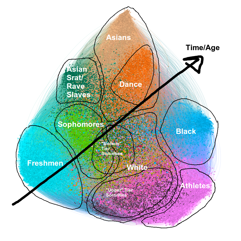
It seems that despite the fact people start college in a diverse social group, they tend to segregate themselves out into homogenous clusters of friends.
Implicit Segregation at Large Schools
Berkeley does a lot to promote diversity, but it can only do so much. Once freshman year is over and the assigned dorms are gone the university can hardly force people to hang out with diverse friends, and it shows. The only non-racial social groups are the dance community and the athletes (except, both are still rather racially segregated, with the dance community being primarily asian and the athletes being white). One might ask why this happens. Perhaps we can look at other schools. Here is UCLA:
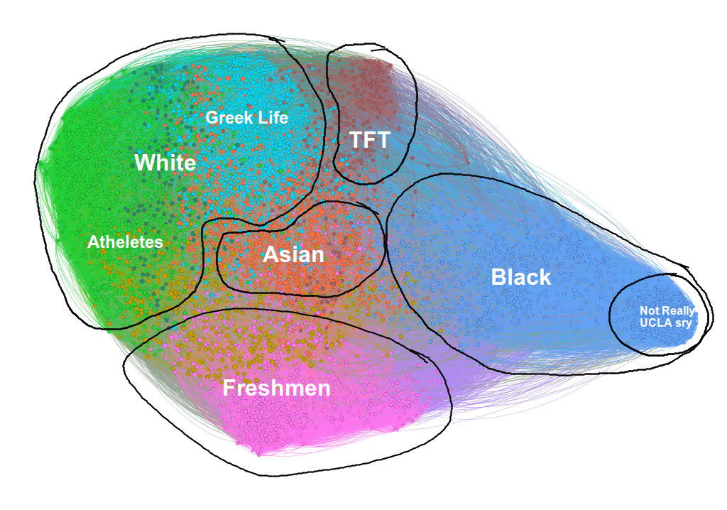
The clusters here are not as well annotated as the Berkeley clusters but I think they do the job. Again, we see a cluster for freshmen and then separate clusters for races. In addition, there’s a cluster for the Theater, Film, and Television kids (which, from as far as what I’ve seen in high school, seems about right!).
But let’s look at Harvard:
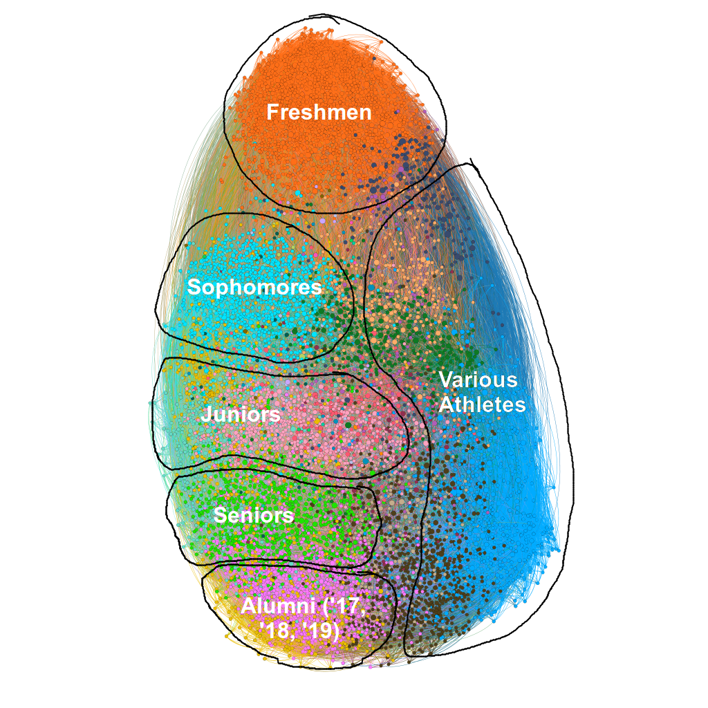
Notice there are no racial clusters! In fact, the only clusters are years and athletes!
So what’s the difference between Berkeley, UCLA, and Harvard? Do people who go to Harvard just see past race? Are Berkeley and UCLA students just subconsciously segregationist?
Here’s my hot take. Most colleges want to have diverse campuses and have mechanisms in place to assure this, whether its outreach to specific high schools, affirmative action, diversity offices, or scholarships. However, these efforts are focused only on the beginning of the “college experience.” Colleges really have no control over what happens after a student gets to campus. At large institutions it’s easy for students to fall into a rut of only hanging out with people similar to themselves. Whereas at smaller schools the benefits of a diverse class carry throughout the entirety of college. In these environments students are constantly forced to interact with people from varied backgrounds. This is of course not to say that other benefits of diversity (increasing opportunity to those marginalized and mitigating racial and social inequality and access to higher education, among other things) are not achieved at larger schools. But many benefits (diverse perspectives and a deeper understanding of other cultures) are lost to students at a large school, simply because they aren’t ever forced out of their comfort zone.
But again, maybe small schools also have this problem. As a counterpoint, consider this: Instagram connections don’t necessarily imply a strong relationship. It’s possible that at small schools small, racially homogenous cliques exist but simply aren’t picked up by the layout of the Instagram social network simply because at a small school everybody can follow everybody in their year and still have a reasonable amount of followers. In a sense, the “resolution” of an Instagram social network is a bit low.
But either way, it definitely seems that the “default” state of social networks, at least large ones, is “segregated.” It’s not entirely clear to me how to solve these problems (or if these problems are actually real, or if they occur only at large schools, or also at small schools), but perhaps it’s at least a start to acknowledge and prevent evidence for the existence of this problem! Perhaps people have already pointed out and thought about this problem. If so please let me know!
A Small Aside
A friend pointed out to me that going from elementary to middle to high school it feels like friend groups get more and more segregated (at least in American school systems in diverse schools where segregation can exist). Her assumption was that “kids don’t see race” and the fact that friend groups become more homogenous is only proof of our innocence lost. But maybe this idea of implicit segregation in large groups is an alternative explanation. After all, apparently studies show babies begin developing racial biases at around six months. Perhaps the only reason why elementary schoolers don’t split off by race is because their social circle is just too small (they spend all day with the same 25-30 kids).
Methodology
A recurring question from friends who graciously agreed to read the first draft of this post was “how can you be sure your analysis was correct?” I will try to address these concerns here.
First of all, this analysis was definitely not rigorous. I’m just a dude coding in his parents’ basement. I have no idea what fancy techniques sociologists use or what the latest hottest statistical machinery is. But I think these results are at least strong enough to point at some interesting things going on, perhaps things worthy of further and more rigorous analysis.
Here I lay out some questions and my responses.
How do you know you scraped the entire school?
I don’t, but I’m rather confident that I’ve gotten most of the school. In the case of Berkeley, we ended up with about 30,000 nodes. This is around the current undergrad population. This is roughly enough to account for some alumni (mostly graduation dates of ‘18 and ‘19), a percentage of Berkeley that doesn’t use Instagram (or doesn’t have very active Instagram accounts), and a number of “organization” accounts.
How do you know the people you scraped actually attend the school?
As explained above we can look for keywords in people’s bios. For example, keywords for Berkeley included “Cal,” “Berkeley,” “UCB,” and “go bears.” We might term these users, who we are pretty confident go to Cal, as “first-order” nodes. If a node is connected to enough “first-order” nodes we could assign “second-order” status to this node, meaning we are pretty sure this node also goes to Berkeley, only because it is associated with people we know with high certainty go to Berkeley. Using this strategy we can verify social networks that we’ve scraped.
How are these clusters found?
The clustering algorithm uses the Louvain method to optimize the modularity of a set of clusters. The clustering algorithm is “unsupervised” in that all it gets is the graph structure. That is to say, it knows nothing of usernames, parsed user bios, profile pictures, or the like. Whatever clusters it comes up with are a result of the connections alone!
How is the network displayed? How do you plot the nodes?
The graph is plotted using the “ForceAtlas2” algorithm. Perhaps a simplistic view of this algorithm is that for every node that is connected we attach an imaginary “spring” between these two nodes with some spring constant. We then relax the system and find a static configuration. This results in nodes ending up close to other nodes they are connected to.
An important observation is that the way we display the nodes has nothing to do with what clusters we get from the unsupervised clustering algorithm. They are two independent processes, both acting on the graph structure of the social network alone. Perhaps the fact that the clusters align with the resulting graph configuration from ForceAtlas2 is further confirmation for the validity of these clusters.
One problem here is that we’re forced to project our graph into a two dimensional space, so we get weird situations where nodes that are part of two clusters will end up smack in the middle of the two clusters and appear not to be part of either! One potential solution is to embed the graph in higher dimensions, but anything above three dimensions (and even three dimensions) isn’t very conducive to visualization!
How did you label each cluster?
There are two main ways to label clusters. The first is by parsing the bios of each person and overlying them on the graph. For example, here is Harvard with years superimposed:
Caption: There are obvious clusters of years here. Years usually come in pairs, including college and high school graduation dates.
Looking at the picture above I think it’s rather undeniable that the clusters correspond to years. Here are some example of bios that include years:
kiss plants, love people // h ‘23
Hopeful | Warren/Social Democrat | Advocate for democracy and decarceration | Casady ‘18 | Harvard ‘22 (he/him)
Seb♥️ / Harvard ‘21 / FL🌴
honestly just a cheese plate fan account • in vino veritas 2020
We can also use the same method as above to label clusters corresponding to sororities and fraternities.
To label the other clusters I unfortunately had to resort to manually checking a subset of users from the clusters. That is, literally go on to Instagram and look at (stalk) a user’s profile. This seemed problematic, but to my great surprise almost every social group was either uniformly a single race or composed entirely of athletes.
When I say “uniformly a single race” I mean uniformly a single race. For example, sampling from the Berkeley asian group (right now in the middle of writing this) I find that 19/20 people are asians, with no doubt. I understand that race is a spectrum and making an assumption about somebody’s race after a brief glance at an Instagram profile ignores so much about a person, but I think any reasonable person would make similar categorizations as I would. It’s a shame that I can’t show any specific profiles, or make the entire network public.
Athletes are much easier to classify, owing to the almost ubiquitous occurrence of a “vanity shot” (or whatever it’s called), as well as many pictures of themselves playing their sport in their uniform. In addition, a dead giveaway are these profiles:
Former UC Berkeley gymnast
Professional Softballer | UC Berkeley Alum
Le Monde ou Rien Harvard Football 2022
Harvard Lacrosse
Is it a mistake to find the clusters first and then look for a unifying attribute? Wouldn’t this tend to lead to a biased analysis of each cluster, a sort of “confirmation bias?”
I would argue not. In fact, Dr. John Snow undertook a similar analysis in 1854 during a cholera outbreak in London in which he first plotted out cases of cholera on a map and then traced the source to a water pump, and in the process founding modern epidemiology. What we’re doing here is not so dissimilar. We first find clusters and then try to determine what “causes” these clusters. To the point of “confirmation bias” I can only say that each cluster had an overwhelming occurrence of whatever its defining attribute was and all other clusters did not. It’s a shame that I can’t show this process, because it’s quite remarkable!
Any closing thoughts?
At the end of the day this project was just for fun and the results are far from rigorous. But that’s not to say the trends don’t exist. If anything I think it would be very interesting if a more meticulous study was done (if it hasn’t been done already!).